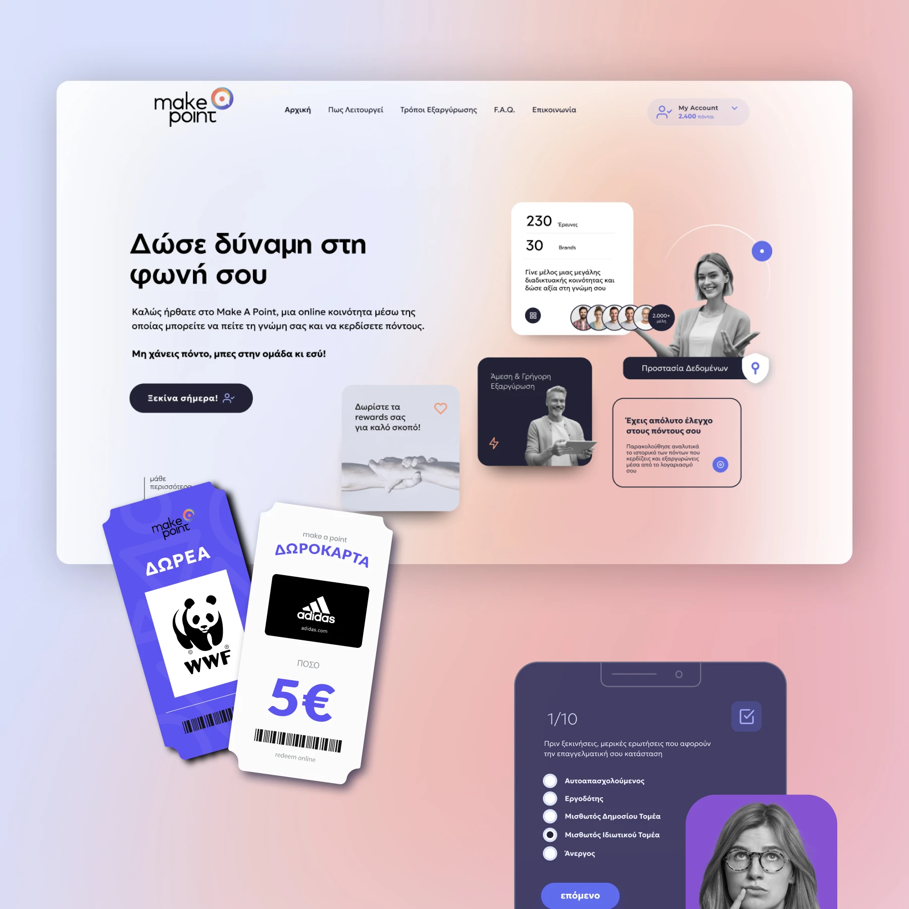
Amplifying the Voice of a Community
Make a Point by Metron Analysis
In the digital age, individuals seek platforms where their opinions can make a real difference. Make A Point aimed to bridge this gap by creating a transparent, user-friendly community for sharing opinions through surveys. However, the challenge was to ensure users felt valued, trusted the platform, and could navigate with ease.
-
My Role
Lead Designer — Feature Scoping, Research, Experience Design, Interface Design, Prototyping, Testing
-
Tools
Figma, UIzard, Hotjar,
Mapping the Path: A Transparent Design Process
The design journey for Make A Point was centered around one key objective:
building trust through transparency.
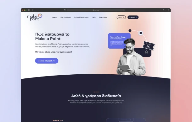
To ensure a seamless user experience, I followed a structured design thinking process that included deep discovery, ideation, and execution.
Each step was guided by user insights, with a particular focus on making the platform professional, intuitive, and empowering for users.
To meet these goals, I followed a structured approach:
- Discovery: Understanding user needs and their hesitations with similar platforms.
- Ideation: Translating insights into intuitive features and journeys.
- Execution: Developing designs that align with both user expectations and business objectives.

Listening First: The Discovery Phase
The discovery phase focused on deeply understanding user behaviors and concerns, aiming to eliminate doubts about the platform’s legitimacy and usability.
Research Methods
- User Interviews
Conducted with potential users to identify pain points around trust, navigation, and clarity. - Surveys
Targeted questions on user expectations for transparency, feedback on the reward system, and how they interacted with similar platforms. - Competitive Analysis
A look into other survey/reward platforms highlighted areas where users felt their voices weren’t truly heard.
Findings:
- Trust Issues
Users wanted reassurance about data security and clarity in how their opinions impacted real-world decisions. - Transparency Matters
Clear communication on point accumulation and redemption was crucial for engagement. - Community Feel
Users needed to feel like their input wasn’t just valuable, but actively driving change in both the commercial and public sectors.
These insights guided a design that prioritizes straightforward navigation, transparency in rewards, and a visual tone that conveyed professionalism and reliability.
Turning Insights into Experiences
Scoping Features
- Points Balance and Redemption History
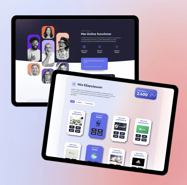
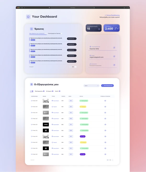
The dashboard was designed to offer clear visibility of users’ points balance, with an intuitive display showing how points accumulate over time. Users can also easily access their redemption history, providing transparency on how and when points were redeemed. This approach not only ensures users feel in control of their rewards but also reinforces the platform’s commitment to openness, fostering trust and encouraging ongoing participation. - Surveys List
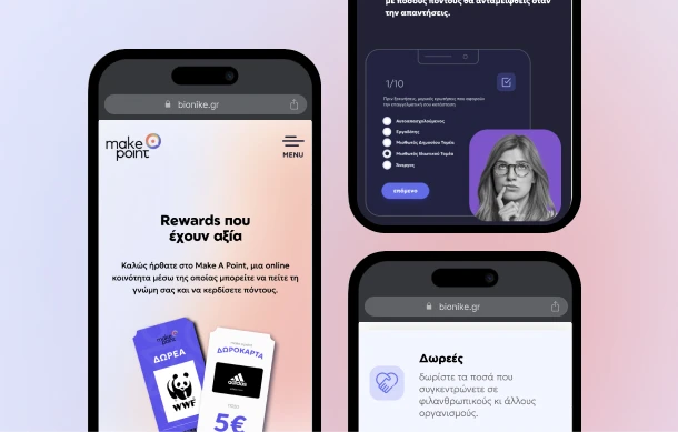
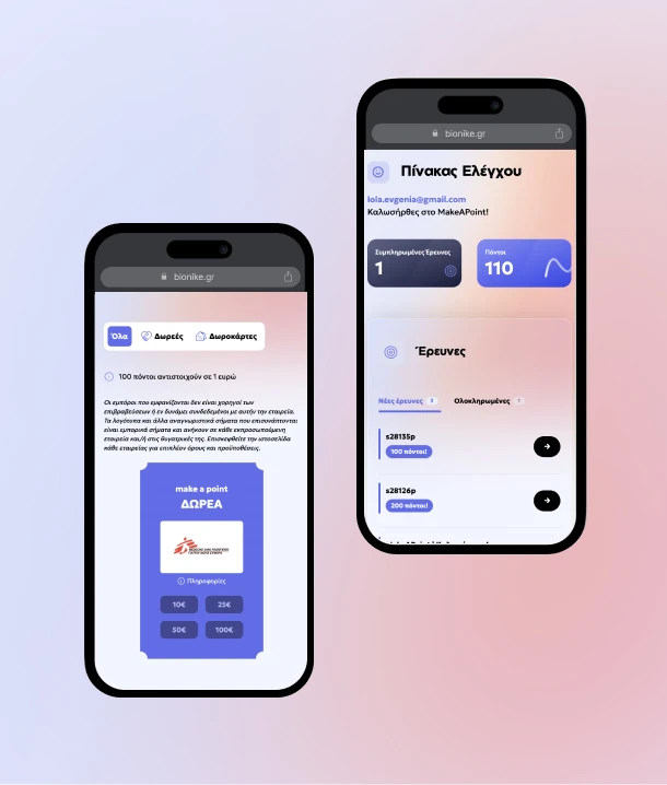
The design of the Surveys List page was focused on providing users with quick access to both active and completed surveys. A clean, organized layout ensures users can easily browse and select available surveys to participate in, while also keeping track of surveys they’ve already completed. This structure simplifies navigation, making it effortless for users to engage with the platform and revisit previous activities, enhancing overall usability and user satisfaction. - Redemption Flow
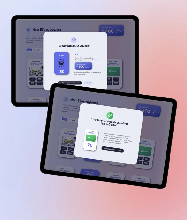
The redemption process was designed to be intuitive, ensuring users could easily understand the value of their points and how to redeem them. Clear explanations were provided on the redemption page, highlighting the rewards available and their corresponding point values. The process flow was streamlined, with step-by-step guidance and simple call-to-action buttons, making it easy for users to complete redemptions without confusion. This focus on clarity and simplicity enhanced user confidence, ensuring a seamless experience from points earning to reward redemption.
User Flows & Journeys
- A journey from survey participation to point redemption, ensuring touchpoints were intuitive and rewarding.
Wireframes
Wireframes enabled early feedback, highlighting needs for:
- Improved navigation between surveys and dashboard.
- Clearer differentiation of survey statuses.
These iterations refined the structure, reducing user friction points.

Designing Trust: The Solution
The final solution emerged through several iterations, shaped by key elements directly informed by user insights and testing phases.
1. Streamlined Dashboard Design
We prioritized transparency by displaying easy-to-read metrics and tables for points balance and redemption history. This allowed users to track their progress and view real-time updates.
2. Simplified Redemption Flow
The redemption process was made intuitive, with categorized rewards and clearly displayed point values. Step-by-step guidance and hover-over explanations helped users navigate the system confidently.
3. Charity Redemption Filter
We introduced a dedicated filter for charity rewards, making it easy for users to select charitable donations, clearly distinguishing this option from other rewards.
4. Iterations on Redemption Table
Through user testing, we refined the redemption table by simplifying the columns to show only the essential data: reward name, point value, and availability. This streamlined approach improved usability and helped users make faster decisions.
5. Refined Navigation Flow
Navigation between available and completed surveys was simplified with visual cues and filter options, making it easier for users to find and engage with surveys without feeling overwhelmed.
These iterative improvements ensured a seamless, transparent, and intuitive experience, allowing users to feel informed and empowered throughout their journey.
Got a project?
We’re a team of creatives who are excited about unique ideas and help fin-tech companies to create amazing identity by crafting top-notch UI/UX.


